Monday, 3 January 2011

NME Front Cover Analysis

The intended audience for this magazine are people that are interested in indie music. The image on the front cover is of Carl Barat a member of the Libertines, who has been shot close up and eye level which creates a link between us as the audience and the image so we feel involved.
The font on the cover is kept very simple and clear to understand; century gothic maybe. However the cover story "I've got a right to tell my story" font looks hand written, this might be because its his speech and therefore in first person, so it needs to stand out against the other writing on the cover to show that it is his point of view. This makes an impact and grabs peoples attention, to make them want to buy the magazine and read it.
The size of the text is kept very uniform and is the same for each cover story apart from the main cover story which is slightly bigger, as that is the story that grabs the readers.
The mise en scene is kept very simple as it is just Carl Barat photographed against a plain white background. His eyes are the main focus that draw us in because they are enticing us in which would link in with the cover story. The layout is also kept very simple with a limited colour palette of red, blue, black and white. Which are the colours of the union jack and the symbol for the band.
The whole framing of the image is very intimate and it makes us feel involved. it is quite personal because of how close the image is which links into the cover story because it is personal to him.

Wednesday, 8 December 2010

How does Plumline construct and reflect its intended audience?

After studying the school magazine I can see that the collective school identity of the audience is addressed through various individual elements such as the mise en scene, use of colour, fonts used, text sizes and the title.
Firstly the mise en scene that is used throughout the magazine are the pictures of students that are placed within the magazine show identity within the school because they are all wearing the school colours or the school uniform which gives our school its own identity that enables the reader to feel a sense of shared experience. In connection with this there are conventions that the magazine follows and are in the same place in every issue of the magazine. These are the issue number, three small images that represent the school as a performing arts school and the date of the issue. All these things are placed directly underneath the title of the magazine. There is also a logo that represents the school with a picture of what the new school will look like in the future in the top right corner.
The use of colour used throughout the magazine is very uniform as all the block colours used are pastel colours that stand out and draw your attention towards the magazine and are used to separate articles from each other so they all stand out. The articles are written in columns like you would find in a newspaper, but by having it written on a different pastel colour makes it less formal and aims it more at the students that attend the school.
Secondly the fonts used in the magazine are kept very simple and are consistent throughout. A basic font of times new roman is used for the articles so that it is clear and concise, and so that it is easy to read. The title of the magazine is “PLUMLINE” which is in italics and is written in capitals, this is so that it stands out and grabs our attention. The name plumline uses part of the name of the school which is Plumstead Manor, so they have taken the plum from Plumstead and incorporated it into the title of the magazine which gives the school collective identity as it is unique to the school and school student, teachers and parents that read the magazine feel a part of a community.
The text sizes throughout the magazine are very consistent, with larger text sizes for the names of the articles published and a standard size 11 or 12 for the actual articles, this is so it is still legible but it’s the right size for it to still be appealing to the audience without it being too big and looking like its aimed at young children. The articles that are written are written by the students themselves which gives the people reading it a different perspective of the school as it is not just an adult writing what people want to hear but it’s an actual student’s experience, which connects with other students reading it because they can relate to it.
The dominant mode of address for this magazine is the students their parents and teachers. The various elements I have written about help to convey an image or send out a message to the targeted group of people that are going to read it. It is almost as if only the people that attend the school or have heard about the school can really understand the concept of what the magazine is trying to tell us.

Vibe Double Page Spread

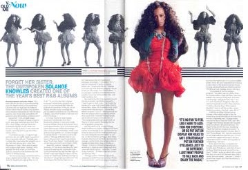
This double page spread is from Vibe magazine. It uses a very basic colour scheme of contrasting colours blue, black and pink. These colours are striking and attract the readers. With the main image being in colour, slightly off center and larger than the rest of the images of the woman gives the readers eyes something to be drawsn to as it stands out the most among anything else on the page. The use of the colour blue to highlight the artists name means readers are able to find who the article is about just by quickly skimming and skanning it. The woman used is stereotypically conforming to the genre that is hip hop as she is of black origin and she is showing flesh and standing in a sexual way with her hands on her back and pushing the rest of her body forward.

Thursday, 25 November 2010

Kerrang Double Page Spread

This double page spread is from kerrang!. You can see clearly that it is a rock magazine because of the images used through the use of colour and the clothing worn by the singers used. The images used all come from a live gig which could imply that rock music is best enjoyed when its live. The guitars used also show that it is rock genre.The smaller images are scattered around the large one of the main singer of the band 'Avenged Sevenfold', this gives it a disorganised and scruffy look. Reflecting on the rebellious and carefree attitude of this magazine and genre. The text in contrast to the image is very little, which could suggest that they want readers to make up their own decision about the band from looking at the pictures rather than reading the text and being influenced by what someone else has said.


NME Double Page Spread Analysis

This double page spread is from NME.  The colours are very simplistic as only blue, black and white are used. This gives the article a clean cut look which conforms to the stereotype of 'Indie'.  The image of the teenagers fills the entire left page which tells the readers whom the article is about along with the bold heading that s written in capitals. From the image we can tell that the band is quite laidback and relaxed, which is then carried through to the layout of the article. 
The heading of the article is bold block written in black to make it stand out against the other writing on the page and against the image used, which draws the eye of the reader. The band members are dressed casually and they are using direct eye contact in the image. This relates to the youthful audience that will read the magazine and makes this sort of lifestyle seem easily obtainable to them, making them aspire to be like this. This is also carried through into the text of the article as it is more like a conversation between people that can be easily related too. The patches of blue highlight the key points of the article, and the use of the white writing on the black background creates a stylish yet simplistic appearance.


NME Contents Page Analysis

This contents page is from indie magazine NME (New Music Express).  
The contents is placed on the right hand side with it split into subheadings indicated by a black strip and white writing to help the reader find what the are looking for easily. The colours used are limited and simple they are red, black and white, which relate to the 'NME' logo, keeping it very uniform. And still appealing to both a male and female audience.
The images used on the contents page  
feature two big stars that the target audience would be into in this specific type of genre. The pictures only take up half the contents page, leaving the other half to be filled with a taster article giving readers an insight into the rest of the magazine. By doing this you could suggest that the target audience are of a higher intellect than the other two contents pages i studied, as they would prefedr to read a little bit about the band than just look at the pictures of bands which feature.

Wednesday, 24 November 2010

Vibe Contents Page Analysis

This is the contents page from R&B magazine vibe. It is very eye catching as the main focus on the page is a picture of Ciara wearing very little. Using an image like this follows the conventions of R&B because that genre of music is very much into body image. It will appeal to both men and women from teenagers upwards in different ways firstly because the colours used are very neutral and secondly it will appeal to women because they will see this image and may aspire to look like her, and it may appeal to men because they can feel a sense of admiration towards her. They layout is very basic and minimal but it still looks sleek and sophisticated. The colour scheme is very minimal with a basic faded grey background that ties in with the colours of Ciara's clothing, and the writing is black and white is used for the title to make it bold and stand out. The title of the page 'contents' is split into three parts creating an impact and catching the readers eye. The actual contents part is right aligned and is separated into two sections; 'Features' and 'Fahion' this makes it easy for readers to find what they are looking for.