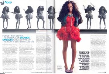
 This double page spread is from Vibe magazine. It uses a very basic colour scheme of contrasting colours blue, black and pink. These colours are striking and attract the readers. With the main image being in colour, slightly off center and larger than the rest of the images of the woman gives the readers eyes something to be drawsn to as it stands out the most among anything else on the page. The use of the colour blue to highlight the artists name means readers are able to find who the article is about just by quickly skimming and skanning it. The woman used is stereotypically conforming to the genre that is hip hop as she is of black origin and she is showing flesh and standing in a sexual way with her hands on her back and pushing the rest of her body forward.
Wednesday, 8 December 2010
Vibe Double Page Spread
This double page spread is from Vibe magazine. It uses a very basic colour scheme of contrasting colours blue, black and pink. These colours are striking and attract the readers. With the main image being in colour, slightly off center and larger than the rest of the images of the woman gives the readers eyes something to be drawsn to as it stands out the most among anything else on the page. The use of the colour blue to highlight the artists name means readers are able to find who the article is about just by quickly skimming and skanning it. The woman used is stereotypically conforming to the genre that is hip hop as she is of black origin and she is showing flesh and standing in a sexual way with her hands on her back and pushing the rest of her body forward.
Subscribe to:
Post Comments (Atom)
No comments:
Post a Comment